Code
# Importing Necessary Libraries
library(knitr)
library(redav)
library(mi)
library(ggplot2)
library(data.table)
library(dplyr)# Importing Necessary Libraries
library(knitr)
library(redav)
library(mi)
library(ggplot2)
library(data.table)
library(dplyr)The data that we will be using to analyze Payroll Data is from the NYC Open Data website and is titled as Citywide Payroll Data (Fiscal Year). The data set was created back in 2015 and has been constantly been updated on a annual basis (last update was on November 28,2023). It tells us about the amount of money spent on salaries and overtime pay for all municipal employees based in New York City. The data is provided by Office of Payroll Administration (OPA).
The data can be downloaded as a CSV file from the website mentioned above. The entirety of the dataset consists of 5.66 million rows (essentially 5.66 million municipal employees) and 17 columns. Every row basically tells us about the employee salary, their work location, agency, base pay, overtime (if any), etc.
However, the dataset is too large for efficient processing. Hence, we randomly sample our data and retrieve 10000 samples for our analysis. The code for the same can be found below, but has been commented out, as such large files cannot be uploaded to GitHub, and rendering will be affected.
# complete_payroll_data <-
#   fread("./Data/nyc_payroll_data_complete.csv")
# # Take Random sample of 10000 rows
# random_data <- nyc_payroll_data[sample(nrow(nyc_payroll_data)),]
# nyc_payroll_data <- randomized_data[1:10000,]
# write.csv(nyc_payroll_data, paste("./Data/", 'nyc_payroll_data.csv'))

#Importing the Dataset
nyc_payroll_data <- read.csv("./Data/nyc_payroll_data.csv")print(dim(nyc_payroll_data))[1] 10000 17# Display Columns of the dataset
# Display Columns of the dataset
kable(data.frame(Column_Names = names(nyc_payroll_data)), "markdown")| Column_Names |
|---|
| Fiscal.Year |
| Payroll.Number |
| Agency.Name |
| Last.Name |
| First.Name |
| Mid.Init |
| Agency.Start.Date |
| Work.Location.Borough |
| Title.Description |
| Leave.Status.as.of.June.30 |
| Base.Salary |
| Pay.Basis |
| Regular.Hours |
| Regular.Gross.Paid |
| OT.Hours |
| Total.OT.Paid |
| Total.Other.Pay |
Presented above are the columns of the dataset.
On further examination of the data, we find that there are few inconsistencies in the data:
The column indicative of the Middle Initial of employees, namely, Mid.Init, does not have explicit NA values. However, it has empty strings such as ““,”-” and “.” which essentially show empty entries and can be considered as NA values. This conversion needs to be made.
“Work.Location.Borough” has different boroughs from different parts of New York State such as Albany, Westchester, Delaware etc. Moreover, Staten Island has been mentioned as Richmond County and Manhattan and Bronx have been mentioned twice, where they differ in capitalization. The data also has empty strings.
For our study, we wish to consider only the 5 boroughs of NYC, namely, Manhattan, Brooklyn, Queens, Bronx and Staten Island. The data needs to be preprocessed for the same.
The salaries for employees have not been mentioned on a consistent scale. We have base salaries mentioned per annum, per day, per hour and on a prorated annual basis as well. The scale needs to be consistent for fair comparisons, and we look to convert the data to a “per Day” basis, so as to compare our results with the daily wage.
Finally, the data after our preprocessing will contain NA values which need to be dealt with.
The above inconsistencies have been made based on our analysis as seen below. For the sake of clean code, we have excluded the code and analysis for those columns which did not have any inconsistencies.
#Analyzing Data to Uncover any Possible Inconsistencies
unique(nyc_payroll_data$Mid.Init)
[1] "A" "" "M" "L" "D" "T" "B" "W" "S" "K" "H" "R" "N" "J" "C" "F" "V" "E" "Y"
[20] "P" "I" "O" "G" "X" "." "U" "Z" "1" "Q" "-"unique(nyc_payroll_data$Work.Location.Borough) [1] "BROOKLYN" "MANHATTAN" "OTHER" "QUEENS" ""
[6] "BRONX" "RICHMOND" "ULSTER" "WESTCHESTER" "DUTCHESS"
[11] "SULLIVAN" "DELAWARE" "ALBANY" "Manhattan" "Bronx" unique(nyc_payroll_data$Pay.Basis)[1] "per Hour" "per Annum" "per Day" "Prorated Annual"Apart from handling NA values, the inconsistencies have been dealt with below:
# Converting Empty Strings to NA values in "Mid.Init"
nyc_payroll_data$Mid.Init[nyc_payroll_data$Mid.Init==""] <- NA
nyc_payroll_data$Mid.Init[nyc_payroll_data$Mid.Init=="-"] <- NA
nyc_payroll_data$Mid.Init[nyc_payroll_data$Mid.Init=="."] <- NA

# Fixing Issues in "Work.Location.Borough"
nyc_payroll_data$Work.Location.Borough[nyc_payroll_data$Work.Location.Borough==""] <- NA
nyc_payroll_data$Work.Location.Borough[nyc_payroll_data$Work.Location.Borough=="Manhattan"] <- "MANHATTAN"
nyc_payroll_data$Work.Location.Borough[nyc_payroll_data$Work.Location.Borough=="Bronx"] <- "BRONX"
nyc_payroll_data$Work.Location.Borough[nyc_payroll_data$Work.Location.Borough=="RICHMOND"] <- "STATEN ISLAND"

nyc_boroughs <- c("BROOKLYN", "MANHATTAN", "QUEENS", "BRONX", "STATEN ISLAND")
nyc_payroll_data <- nyc_payroll_data[nyc_payroll_data$Work.Location.Borough %in% nyc_boroughs,]

# Making Data Scale Consistent in Base.Salary through Pay.Basis
# Adding new column "Daily.Salary"

nyc_payroll_data <- nyc_payroll_data[!(nyc_payroll_data$Pay.Basis %in% "Prorated Annual"),]

nyc_payroll_data <- nyc_payroll_data |>
  mutate(
    Daily.Salary = case_when(
      Pay.Basis == "per Hour" ~ Base.Salary * 24,
      Pay.Basis == "per Annum" ~ Base.Salary / 365,
      TRUE ~ Base.Salary
    )
  )
We save this data as a CSV and read the cleaned version for the next segment.
# write.csv(nyc_payroll_data, "./Data/cleaned_nyc_payroll.csv", row.names = FALSE)
clean_nyc_payroll <- read.csv("./Data/cleaned_nyc_payroll.csv")To understand the compensation distribution, we plan to use a boxplot along with a ridgeline plot to study the distribution of the median and the mode of the data. We would like to make this comparison across boroughs.
While understanding the distribution of daily pay is important, we also plan to see how these salaries are broken down and how various components of these salaries are distributed across boroughs. Grouped bar charts are the best method to understand how these components vary.
Each borough has a budget based on the city’s policies. We want to analyze the sum of daily salaries for each borough, to see how the budget should be allocated.
Using a bar plot, we also want to see which boroughs have the most number of workers, and we want to analyze why this is so.
There are various municipal agencies in NYC. Some are more prominent than the others. This could be a result of the need of the city, the priorities or the preference of the people. Using a faceted cleveland bar plot, we would like to see how workers are distributed across some of the most prominent agencies in NYC.
Each borough has some jobs which people prefer. Using a heatmap, we would like to see which job titles have the most number of workers for each borough.
A very important study that needs to be conducted is about the fairness of overtime pay. We plan to use a parallel coordinate plot to show the relationship between Years of Experience, Daily Salaries, Overtime hours and overtime pay. This plot will help us study relationships across multiple variables and unearth any biases or issues.
We would also like to see how the base salary and overtime paid vary with each other, and whether they have any correlation, using a scatterplot.
We also aim to analyze the leave status and workforce dynamics. Leave status typically indicates whether an employee is on leave or not, and if so, what type of leave they are on. This information is often valuable for City Council and management to understand workforce availability, plan for staffing needs, and monitor employee well-being. Along with this, we also use the basis for paying an employee, and whether that has any connection to their current employment status.
We also plan to make use of D3 to make an interactive and animated plot, to show the proportion of the average daily salary across various boroughs, for each year.
colSums(is.na(clean_nyc_payroll)) |> sort(decreasing = TRUE) Mid.Init Payroll.Number
3594 2856
Fiscal.Year Agency.Name
0 0
Last.Name First.Name
0 0
Agency.Start.Date Work.Location.Borough
0 0
Title.Description Leave.Status.as.of.June.30
0 0
Base.Salary Pay.Basis
0 0
Regular.Hours Regular.Gross.Paid
0 0
OT.Hours Total.OT.Paid
0 0
Total.Other.Pay Daily.Salary
0 0 We see that only two columns, namely Payroll.Number and Mid.Init have missing values.
plot_missing(clean_nyc_payroll, percent = FALSE)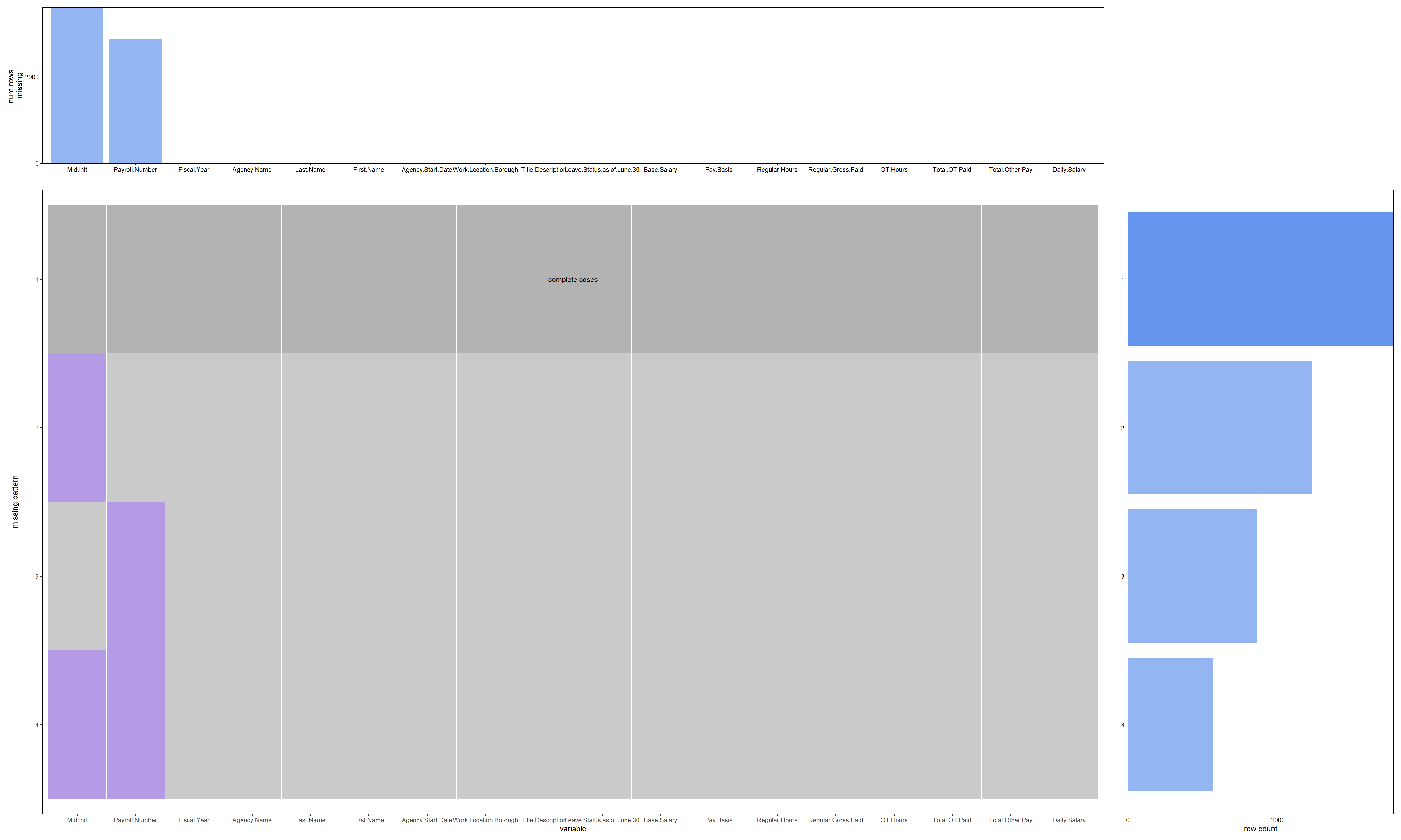
As can be seen from the above plot, there are four patterns which can be observed in our data. The first being the complete lack of NA values, whereas the second pattern exhibits missing values in one column only, namely, Mid.Init. There are also rows where only Payroll.Number have missing values, and where both these columns have missing values at the same time.
The graph on the right shows that there are nearly 2000 rows exhibiting the second pattern, about 1750 rows exhibiting the third pattern and 1000 rows with missing values in both columns.
We also get to see which columns have missing values in the form of a bar chart on top, and see that two columns falls under this category.
missing_data.frame(clean_nyc_payroll) |> image()NOTE: The following pairs of variables appear to have the same missingness pattern.
Please verify whether they are in fact logically distinct variables.
[,1] [,2]
[1,] "Last.Name" "First.Name"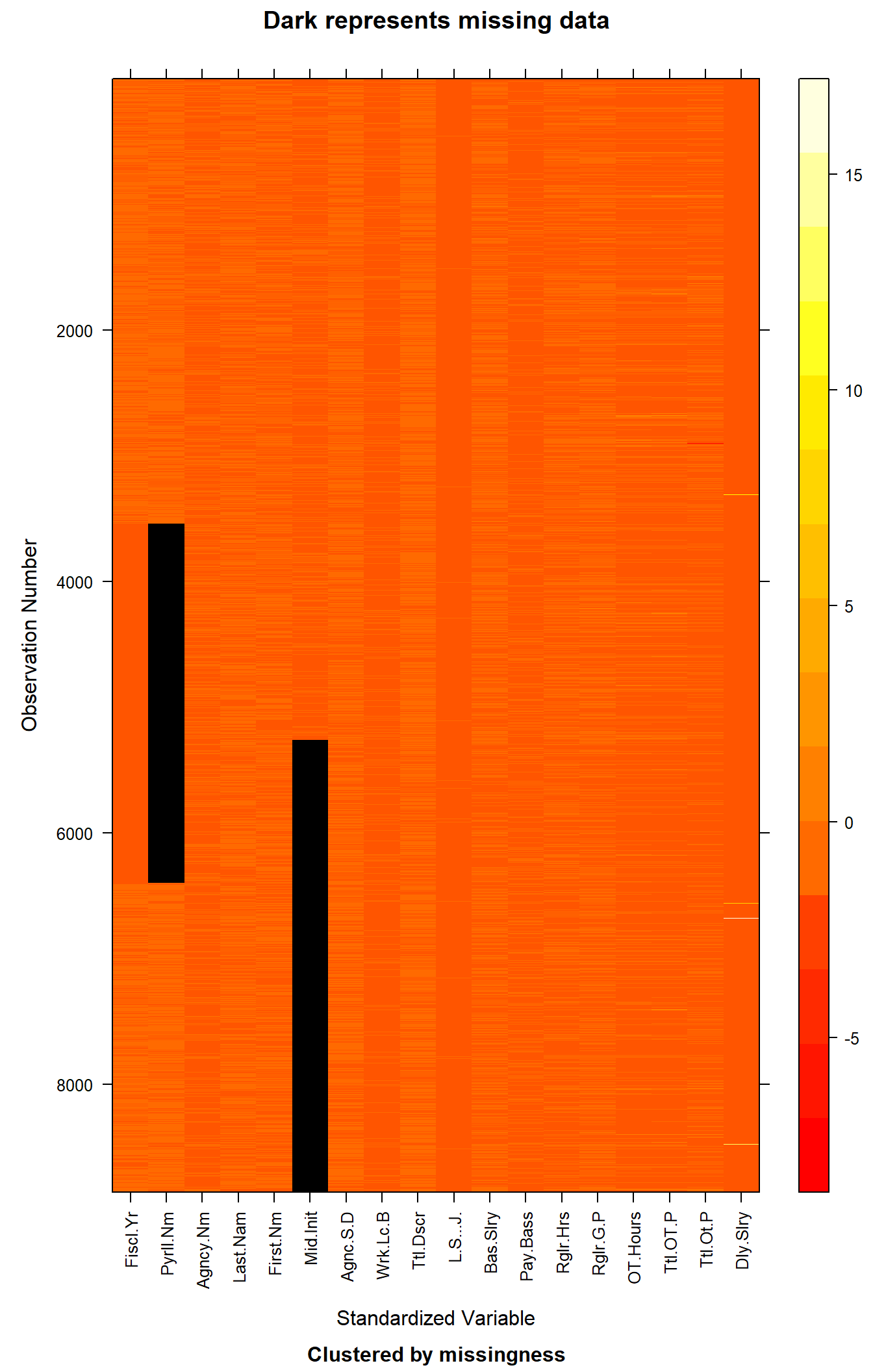
This graph shows us the missing values in the entire dataset. The cells represent the actual values after scaling, defined by each row and column of the actual dataset. Higher values take on the lighter colors, whereas colors close to red represent values which are lower.
The values in black, indicate missing data. There is no clear pattern which defines why or how a row has missing values. The missing values seem to be random and not related to other columns.